Five Mistakes You’re Making on Your Website
As expert web designers, we are always critiquing websites and analyzing what can be done better to ultimately help a business grow it’s revenue and convert leads into paying clients.
With that being said, let’s just say we’ve SEEN IT ALL! 👀 All sorts of websites and many with some pretty big red flags when it comes to effective web design. 🚩 In fact, we could go on and on & write a long-list of mistakes people commonly make on their website, but we’ve narrowed it down to 5 that really have a big impact.
We are firm believers that websites are like storefronts and if not thoughtfully designed with the user-experience and search engine optimization in mind, within seconds potential clients can easily be drawn away, or you can miss out on a wider group of leads too!
In this blog post, we’re going to chat about the Five Common Mistakes people tend to make on their websites that we’ve seen over and over again, so let’s dive right in!
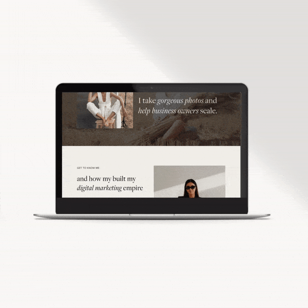
Mistake 1: Your Homepage doesn’t explain what you do
Within seconds, your Homepage needs to tell interested clients who you are and what you do, or what your company does as a whole. There’s nothing worse than visiting a website and overall just feeling confused what the business actually does. We like to call this statement your elevator pitch. It’s short, concise and straight to the point, telling visitors what you specialize in and how you can help them!
Mistake 2: Way too much text
We’ve seen it all too often! No one wants to read paragraphs on paragraphs of text on your website, in fact, it can drive potential clients away real fast!
Good content doesn’t have to be lengthy. It needs to be meaningful. Less words, with more thought behind each word and phrase can have a HUGE benefit for you on your website!
So what do we mean by more thought behind your words? This is where keywords come into play. Selecting the right words to use to improve your SEO (Search Engine Optimization) rankings. Having too much text not only overwhelms readers, it also negatively impacts the overall design aesthetic, affects your conversion rate and can ultimately harm SEO too. 😣
Mistake 3: Cringe worth stock imagery
Tacky stock imagery that doesn’t match your overall brand aesthetic can drive traffic away from your website real fast.
We truly think investing in a brand photoshoot that’s in-line with your brand aesthetic is a game changer for your website. It creates consistency, credibility and helps to build trust with your potential clients. Good brand photography serves as a visual storyteller, allowing for business owners to tell their story, without having to say a word!
We totally get that hiring a brand photographer may not be within everyones budget. If this is the case, we’d suggest carefully sourcing authentic (non-cheesy) stock imagery that matches your overall brand aesthetic and is from your non-typical stock imagery sources (ie. Istock, Shutterstock), and instead from platforms such as Pexels or Unsplash. 🙌
Mistake 4: Not having clear CTA’s (Call to actions)
Much like welcoming a guest into a storefront and showing them around your store or guiding clients to the checkout area when they are ready to purchase a product, a website with strong Call to Actions offers the same sort of experience!
Call to Actions help to guide users through an overall shopping experience, telling potential clients what to do next and how to proceed to buy a product, or get in touch to work with you and are hugely important for any website to help reduce your bounce-rate & increase your revenue!
Mistake 5: Not optimizing your website imagery for SEO
This one in particular is a little more “behind the scenes” of a website, however, very impactful in getting your website found on line and ranking higher on search engines.
We’ve seen so many websites where extremely large image files have been uploaded onto the site, and not properly compressed beforehand and optimized for SEO.
Compressing your large images into a file size small enough for a website (ie. less than 1 MB) will help to improve your site loading speed, further reducing your bounce rate. In addition, re-naming your image files using strong keywords for your business (ie. Instead of having 2716.jpg as an image name, why not use XYZ-Company-Nelson-Wedding-Photography.jpeg instead?)
In todays competitive markets, it’s so important to take every action possible to optimize your website for search engines, so you can rank higher amongst your competition and get found online first!